“It takes zero effort to make your experience or application not inclusive. It only takes a little bit of effort to make inclusive”
-Christopher Patnoe. Program Manager at Google’s Accessibility Team.
Virtual Reality (VR) offers a whole world of possibilities. We can achieve things that otherwise wouldn’t be possible to us in the real world and could be a very powerful tool for people with some sort of impairment.
Imagine someone in a wheelchair climbing up a mountain. Or someone with total loss of their body’s movement moves around with no limitations. If you ask me, that is truly magical.
Taking accessibility into consideration throughout the development of the VR product will maximize the chances of having a positive and memorable experience for all kinds of users. If we consider accessibility in the early stages of our product, we not only create an inclusive experience, but also save valuable resources by not having to go back and incorporate new features or even redo them.
In this article, we’re going to discuss some accessibility best practices to make VR experiences positive and memorable for all users.
VR for Visual Impairments
Color blindness is one of the most common visual impairments. It is important to add different options to allow users to experience the product in the best way possible.
One common way to address this is by playing with different shapes and patterns when dealing with multiple options. Also, having a very dark color option against a very light one is another solution to make it intuitive for the user. To make it even more descriptive, try combining the options with text labels.
One best practice to follow is to incorporate the ability to fully customize the color spectrum of the entire site, having the ability to change the contrast, brightness, and saturation. This way, users can adjust the settings to their liking.
Having presets already built according to the type of colorblindness is a good option to help the users set their preferred color scheme. A good approach is to have presets for the most common types of colorblindness, which are: Protanopia (unable to distinguish red and green), Deuteranopia (unable to perceive green), and Tritanopia (unable to distinguish blue and yellow).
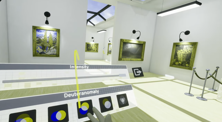
Presets of various color bling settings
When designing for people with limited vision, it is advised to use different sizes of text when communicating. For example, an important cue can be displayed in a larger size to help differentiate it from not-so-important ones.
One key guideline is to make the sound your ally. Sound is a powerful navigation tool when we want users to follow a specific path or locate an object. This can help users accurately guess the distance and placement of the object. Adding sound also makes experiences more immersive.
Just as with color, allowing users to fully customize the audio helps them navigate the world smoothly according to their audio equipment, real-world ambient noise, or hearing impairment.
Using Close Captioning (CC) in the VR World
CC Designers have come up with useful guidelines to place them in ways that are readable for users and don’t interfere with important stuff going on in the screen. Much of this same guideline can be applied in VR.
Users should be allowed to update the font size and brightness of the subtitles shown until they are easy for them to read. To make it easy to set it up, it is a good practice to have three pre-built options.
According to the research team at Meta Quest, the three types of presets that should be included are: a preset that matches your site’s aesthetic, a sans-serif font for easy readability, and a dyslexia-friendly font. It is also recommended that you’re the text be placed in front of a background that creates a good contrast with the text.
To design a Dyslexia-friendly font, Meta Quest suggests a sans-serif font with kerning of around 35% of character width and spacing between words of 3.5x of character width. Designers should also avoid using underlines and italics.
When CC is linked to a specific source, it is important to show an arrow pointing to the source alongside the subtitles. This way the user can always locate where the sound or text is coming from.
The VR game Vacation Simulator does a fantastic job applying all the CC best practices, shown in the example below.
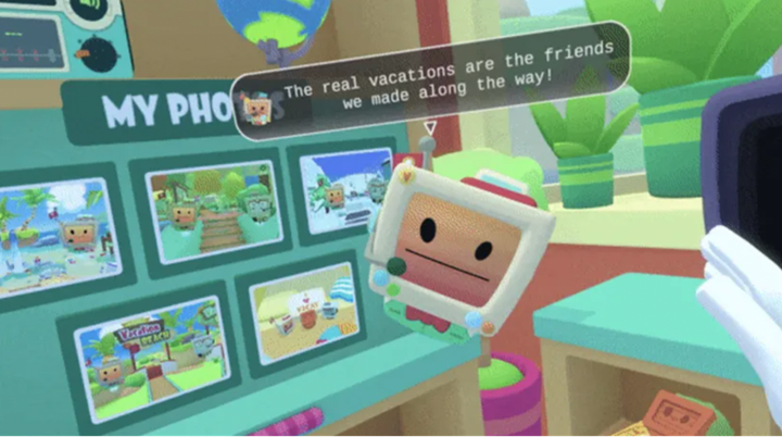 An example of well-designed CC subtitles for a character in Vacation Simulator
The rule of thumb is that you should be able to navigate the site entirely without the need for sound. If you can achieve this, you have successfully created accessible CC.
Movement in VR
It is important to consider mobility. One commonly used mechanic in VR is to make users move their heads around to view the complete landscape of the world. It is important for designers to add alternatives for this movement. Degrees of Freedom (DoF) could be of two types: 3 DoF, which means one can only rotate their head. And 6 DoF, which not only allows you to rotate your head, but you can also move anywhere in the world. The Degree of Freedom you should use depends on the type of experience you want to deliver.
One option for accessible movement is to have a single-button navigation, triggered by the press of a button in the controller to turn around (3 DoF) or even move anywhere in the world (6 DoF). Another popular solution is to use voice commands, which also help users who are unable to use their hands freely.
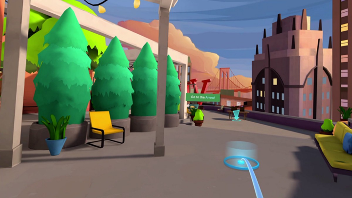 Example of how to apply movement with the press of a button. User is transported to where they specify.
When an important scene is taking place, users should be able to focus the camera on that scene. It is advised to add cues to describe that an important moment is taking place and to help the user position the camera.
Another key aspect to consider is interaction with objects. Depending on the nature of the experience, users might need to grab objects that are either on the floor or raised to a certain level.
Users should be able to pick objects from a distance. Hovering the object from a certain distance should be more than enough to trigger the action to grab them.
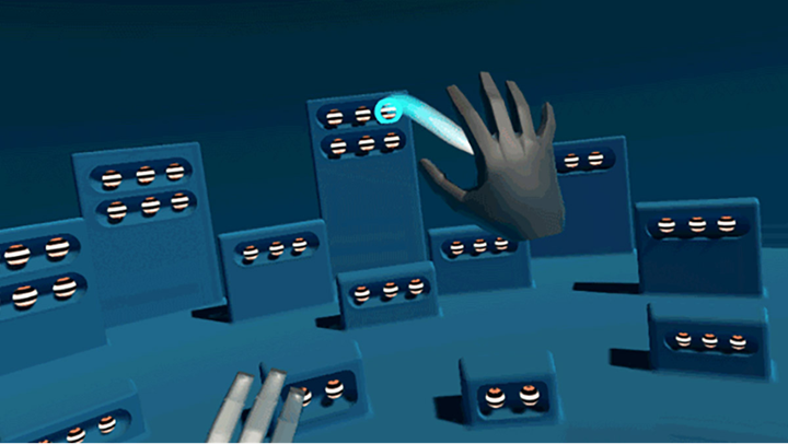 A hand specifying which object to grab from a distance. The object is highlighted as a hover state.
Adding Feedback
One of the most important aspects of any type of experience is receiving feedback. Knowing what is going on around and what should be done next is crucial to deliver a positive experience for users.
The combination of cues, text display, and orientation, among many others; allows us to communicate the state of our surroundings and the next steps.
Try using your product with a grey-scale on, no audio, and while sitting in a chair. Then ask yourself: Do I know what is going on right now? Do I know what needs to be done? Can I move around comfortably?
Of course, nothing beats testing with real users.
Conclusion
In my experience, no matter how many guidelines or good practices we follow in our designs, there are always constraints in delivering an exceptional experience. The only way to be sure is by testing products with real users. Only then will we validate if our design is accessible or if there are changes to be made.
I encourage anyone who is reading this article to deliver an accessible product, especially when designing for VR. Having the opportunity to move and do the things we normally aren’t able to do is, in my opinion, where the true magic begins.
Sources
- Meta Quest, (2022). Meta Quest Virtual Reality Check (VRC) Guidelines. Meta. Menlo Park, California.
Source: https://developer.oculus.com/resources/publish-quest-req/ - Meta Quest, (2022). Designing Accessible VR. Meta. Menlo Park, California.
Source: https://developer.oculus.com/resources/design-accessible-vr/ - Google Developers, (2018). Accessibility for AR and VR. Google. Mountain View, California.
Source: Accessibility for AR and VR (Google I/O '18) - Google VR, (2018). Degrees of Freedom. Google. Mountain View, California.
Source: https://developers.google.com/vr/discover/degrees-of-freedom#:~:text=3DoF%20head%2Dtracking%20means%20you,track%20both%20position%20and%20rotation.
About Encora
Fast-growing tech companies partner with Encora to outsource product development and drive growth. Contact us to learn more about our software engineering capabilities.

