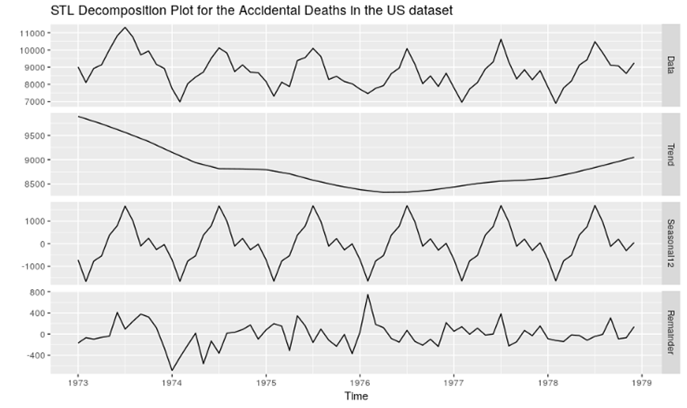
Summary
This article summarizes some of the challenges that we observe as part of User Interface (UI) and User Experience (UX) designs, and how a few straightforward steps can be taken up to improve outcomes for the end users.
Introduction
In layman terms, User Interface (UI) is anything that a user interacts with while using a product or a service. The term was probably born with Apple’s release of the Mac that included a point & mouse click.
User Experience (UX) is what a user feels while using a product or a service, especially from a usability perspective.
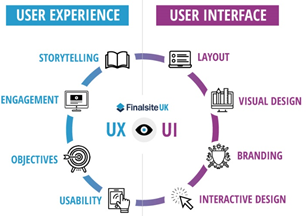
A simple pictorial representation of UI vs UX would be something like this:
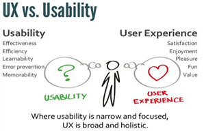
To quote a summed-up difference between UI & UX by Don Norman and Jakob Nielsen (with a small change):
“It’s important to distinguish the total user experience from the user interface, even though the UI is obviously an extremely important part of the design. As an example, consider a website with healthcare institution reviews. Even if the UI for finding a hospital is perfect, the UX will be poor for a user who wants information about an independent clinic if the underlying database only contains the major hospitals/institutions.”
Over years, every one of us has had negative experiences & challenges with UI/UX aspects of a product or service. Here are some of the challenges that users commonly experience and some of straightforward methods to improvise UI/UX in order to overcome these challenges.
Challenges
Taking a digital health care system as an example identify challenges and concerns that users generally experience:
- Low Findability or Discoverability – Difficulty in finding important information or a commonly used button in a web page. As an example, the “login” button may be visually too small, or in a difficult to find position.
- Complex workflows – Examples could be user registration process or clinical workflows in a healthcare ecosystem. Clinicians often complain that EHR workflows tend to focus on capturing data that the physician might need, instead of focusing on the patient & their needs.
- Menu overload – Overloading a menu with multiple options, some of which might not be relevant to the menu title. An example could be displaying different navigational options in an edit menu.
- Overwhelming number of options to choose from – Providing too many options for a user to click within a single page.
- Number of clicks – This is a relatively common problem that most of us have faced in different ecosystems. Too many clicks drive loss of interest for a user. Examples include having to click through popups and the continuous click of the mouse to arrive at the desired destination web page.
- Lack of empathy in design – Providers in most clinical workflows in healthcare ecosystems end up spending more time understanding the technology, rather than having a connection with the patient.
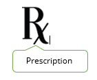
The following example provides another perspective.

Is the above image intuitive for everyone? It probably is, for everyone who works in or support the healthcare sector. But what about others? Let’s try the following image:

This is something that everyone can understand. But when building a digital healthcare product, which one would be preferred?
It is probably the former image. Is there though, an opportunity to improvise the UI and UX in that image? Let’s look at some improvisation techniques.
Steps to improvise
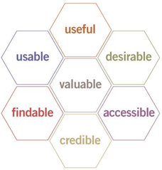
Peter Moreville developed a “Usability Honeycomb” which highlights how to achieve an effective UX design.
Here are some considerations that could be leveraged to improve the UI/UX design:
- Have a dedicated UI/UX designer in place, who could undertake market research, identify user needs and come up with an appropriate design satisfying various stakeholders & design parameters while using appropriate tools.
- Conduct surveys or get regular feedback - Focus group meetings with different sets of user base should be conducted. As a guideline, focus group meetings can be conducted using some of the following parameters:
- Customer who’s been using the product or service for the longest period.
- Some of the largest clients.
- Some of the smallest clients.
- Some clients from the median range.
- Some of the newly added clients.
These parameters can assist understand needs of different customer sets and help address concerns at an early stage.
- Ensure that there’s a goal in mind when iterating & building the design. A clear upfront goal also assists overcome challenges such as lack of discoverability.
- Minimize & optimize navigation and clicks. For instance, instead of displaying an error message pop up, navigate the user directly to the field with the relevant error.
- When displaying the page, constantly evaluate the user interaction with the content on the page. Wherever possible, it is desirable to keep the layout simple and auto-populate as much data as feasible.
Now let’s revisit our earlier example related to the Rx Vs Prescription images, and attempt to create some quick potential solutions.

One possible solution could be the above image. In a digital interaction though, the simplest possible solution could be the one depicted below. Not only does this save precious real estate, but also complies with standards and regulations in healthcare, while eliminating most causes of confusion.
Key Takeaways
To summarize, we:
- Identified the differences between UI & UX.
- Reviewed couple of common issues that users experience relative to UI / UX.
- Looked at some simple techniques to address these issues & challenges.
- Used an example from healthcare to clarify the above.
About Encora
Join Us at Encora
Are you a developer or engineer looking to make an impact on the world through technology? Visit Encora careers to join a passionate community of innovators and receive unmatched opportunities for professional development and benefits.
Fast-growing tech companies partner with Encora to outsource product development and drive growth. Visit Encora.com to learn more about our remote teams and augmented teams innovating in cloud enablement, big data, QA, AI, DevOps, and more.